BLACK CREEK GROUP
LOGO DESIGN / STATIONERY / BRAND IDENTITY / CUSTOM WEB & UI DESIGN
In the vibrant Toronto real estate market, Black Creek Group (BCG) stands out by focusing on authentic relationships and significant change rather than flashy marketing tactics. This thoughtful, brave, and minimalist approach shows how a brand can establish meaningful connections with its audience to leave a lasting impression.
We collaborated closely with BCG to create a striking brand identity grounded in the philosophy of "less is more." Their logo, an abstract mark inspired by water and creativity, symbolizes a bridge—inviting clients to new possibilities and progress. The application of a neoclassic-serif typeface carries a traditional sense of widsom and modernity to create an identity that feels both timeless and relevant.
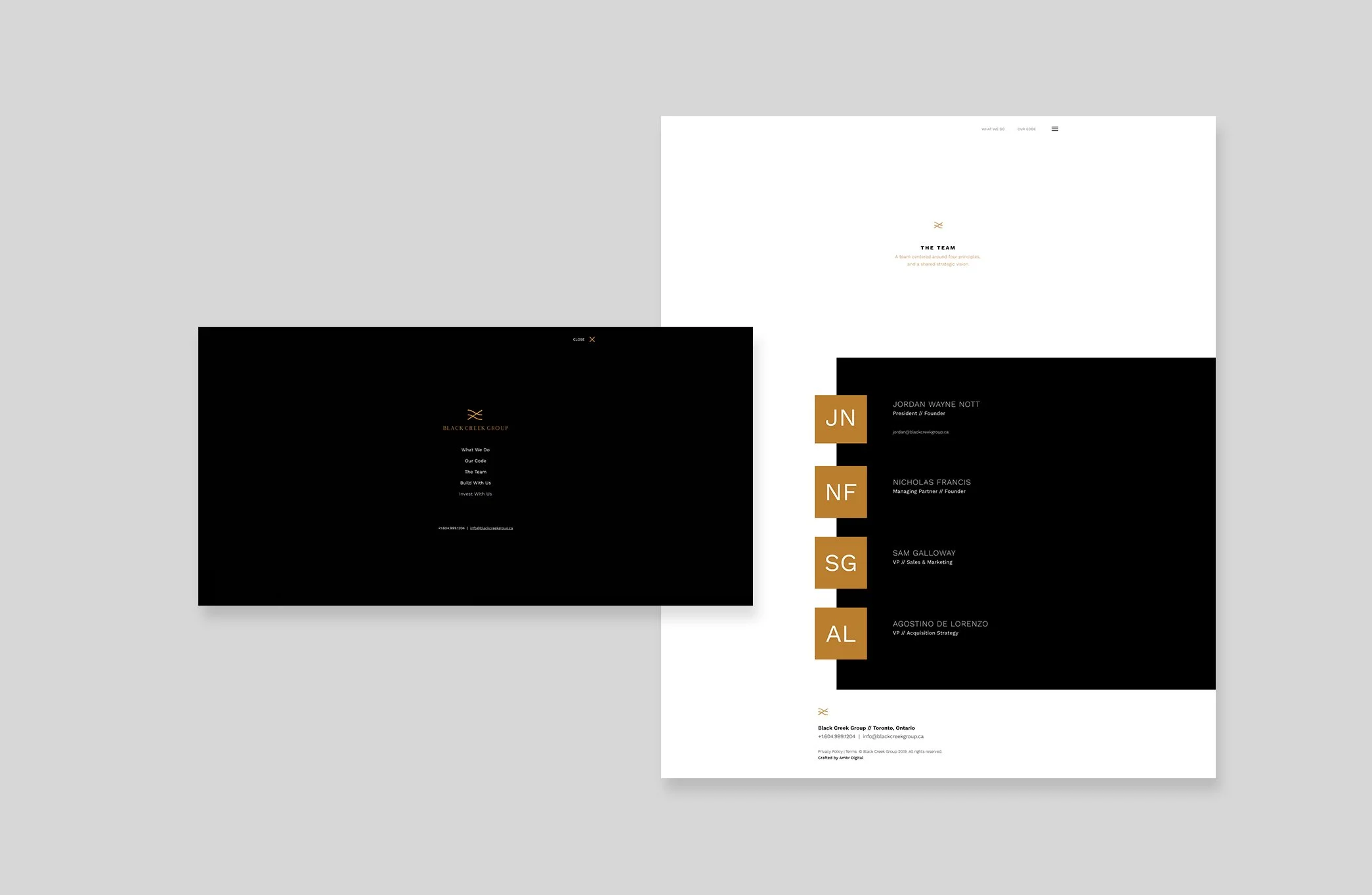
To bring this identity to life online, we partnered with Ambr. Digital to design a custom web and user interface that mirrors BCG's minimalist philosophy. The result is a website that exudes quiet elegance and luxury without resorting to flashy tactics. The design is clean and intuitive, allowing users to navigate effortlessly and find information without distraction.
BCG's approach to branding and web design is a masterclass in the power of simplicity. By focusing on meaningful connections and clear communication, they've created a brand that resonates with clients seeking authenticity and excellence. Their online presence isn’t just a platform, it’s an extension of who they are and what they stand for.


